
.png?width=50000&height=50000&name=Miley%20Cyrus%20(4).png "Miley Cyrus (4)")
Research
Typography
The typographic strategy relies heavily on script-based fonts to cultivate an intimate and accessible brand identity.
-
Personal Connection: The use of a fluid, handwritten-style script for the album title feels personal and diary-like, almost emulating a signature. This fosters a sense of authenticity and direct connection with the audience.
-
Textural Depth: This aesthetic is reinforced by a low-opacity script pattern integrated into the background. This layering adds visual texture and depth to the composition while maintaining a cohesive, gentle theme.
Color Palette
The design leverages a focused, monochromatic color palette to direct the viewer's attention and establish a specific mood.
-
Symbolic Color Choice: The vibrant purple background is symbolic of youth, creativity, and fun, aligning perfectly with the album's target demographic.
-
Creating Focus: A soft, bright highlight is centered on the artist's face, immediately establishing it as the primary focal point. This is enhanced by a subtle vignette effect—darkening the corners of the frame—which draws the viewer's eye inward and adds a professional, polished finish.
Photography and Art Direction
The art direction portrays Cyrus in a moment of calm introspection, carefully balancing her roles as a pop star and a musician.
-
Approachable Demeanor: Her closed eyes and relaxed, casual pose suggest a sense of dreaminess and serenity. By avoiding a direct, confrontational gaze, the portrait feels approachable and non-threatening.
-
Musical Signifiers: The prominent inclusion of the guitar is a critical signifier. It grounds her identity as a musician and songwriter, signaling a transition beyond pure pop performance.
Compositional Analysis
While appearing simple, the composition uses a combination of stability and movement to create a visually engaging image.
-
Stable Foundation: The subject is largely centered against a clean, uncluttered background. This creates a stable and balanced visual field, ensuring the focus remains squarely on the artist.
-
Implied Movement: The composition avoids feeling static by incorporating strong diagonal lines. The vectors created by her raised arm and the neck of the guitar intersect the frame, introducing a subtle dynamism that animates the otherwise tranquil pose.
Brand Positioning and Artistic Evolution
This album cover is a masterclass in brand positioning. Every element works in concert to project an image of innocence, accessibility, and youthful sincerity. The modest styling and calm demeanor were precisely calibrated to resonate with her younger audience.
Viewed retrospectively, this cover serves as a crucial "Point A" in her visual narrative. It establishes a foundational identity of approachable pop-stardom, which makes the stark, rebellious visuals of the Bangerz era, the glam-rock aesthetic of Plastic Hearts, and the mature confidence of Endless Summer Vacation all the more impactful as deliberate, evolutionary steps.
Low-Fidelity Wireframe
Objective: This low-fidelity wireframe proposes a modernized redesign of Miley Cyrus's 2009 EP, "The Time of Our Lives." The primary goal is to channel the album's melodic, pop-centric sound through a refined and structured composition. By focusing on the core visual elements of line, shape, and texture, this redesign aims to enhance visual depth and create a more distinct focal point while honoring the spirit of the original artwork.
Design Rationale & Key Changes:
-
Shape as a Focal Point: The most significant change is the treatment of the central circular element. Instead of a soft highlight, a crisp circular shape is used as a cutout, revealing the artist. This intentional use of a hard-edged geometric form creates a powerful sense of dimensionality—as if viewing the artist through an aperture. This approach draws inspiration from the clean, geometric framing seen in Art Deco design, immediately focusing the viewer's eye.
-
Line and Texture for Energy and Balance: The original's slanted background text is retained but reimagined as a background texture. The diagonal lines of text are now isolated outside the central circle. This decision serves two purposes: it maintains a sense of dynamic energy in the composition while ensuring the portrait of the artist remains clean and uncluttered.
-
Hierarchy and Composition: The composition is centered to create a more stable and balanced layout. By placing the artist's name and the album title directly below the circular frame, a clear typographic hierarchy is established. This grounds the entire design, giving it a solid foundation that feels both modern and timeless.
Intended Outcome: The intended result is an album cover that feels both nostalgic and contemporary. The clean, illustrative line work of the portrait captures the calm and innocent mood of the music, while the strong, geometric shapes provide a confident, updated structure. The design brings the sound to life by framing its gentle, youthful energy within a more mature and graphically sophisticated visual system.

Color
Objective: The goal for the color palette was not to discard the original's identity, but to evolve it. Building upon the wireframe, this stage introduces a refined color scheme that elevates the design's mood to align with a more mature and timeless aesthetic, while still honoring the essence of the original 2009 release.
Color Theory & Application:
-
Scheme Selection: A monochromatic color scheme was chosen, centering on the original's signature purple. This approach creates a powerful sense of harmony and visual cohesion. By using various tints, tones, and shades of a single hue, the design feels unified and intentional, allowing the focus to remain on the composition and the artist.
-
Palette & Rationale: The original vibrant purple was intentionally desaturated to create a more muted and sophisticated palette. This tonal shift is the key to transforming the cover's emotional resonance. The new, deeper purples move the mood away from the bright innocence of the original and evoke a sense of maturity and introspection. This palette provides stronger contrast, allowing the typographic elements and the central portrait to stand out with greater clarity.
-
Connecting Color to Sound: This refined color scheme is designed to connect more deeply with the authentic, simple sound of the music. The less saturated, more grounded colors reflect the sincerity in Cyrus's songwriting, creating a visual experience that feels both calm and confident.
Technical Considerations:
-
Color Mode: The design was executed in the RGB color mode, as is standard for digital-first applications like the Canva platform used for this project. This ensures the colors appear vibrant and accurate on screens. For a commercial print run of the album cover, the design files would be professionally converted to the CMYK color mode to guarantee fidelity and consistency in the final printed product.
.png?width=299&height=299&name=Miley%20Cyrus%20(2).png)
.png?width=149&height=149&name=Miley%20Cyrus%20(1).png)
Typography
Objective: The typographic strategy for this redesign was to establish a clear visual hierarchy that is both legible and emotionally resonant with the album's light-hearted, youthful energy. The goal was to move away from the original's reliance on a single script font to create a dynamic contrast that makes the artist's name and album title stand out as distinct, impactful design elements.
Typographic Analysis & Strategy:
-
Critique of Original: The original design uses a signature-style script for all typographic elements. While this effectively communicates a personal, fun aesthetic, its repetitive use creates a lack of contrast, causing the primary text to blend into the background rather than command attention.
-
Creating Contrast with Font Pairing: To solve this, a new typographic system was developed based on the principle of high contrast. The pairing of a strong, geometric sans-serif with a fluid, personal script creates a sophisticated visual dialogue.
-
Font Selection & Rationale:
-
Artist Name ("Miley Cyrus"): The font Norwester was selected for the artist's name. As a condensed, geometric sans-serif, Norwester provides a powerful, structural anchor for the entire design. Its sharp angles and uniform lines contrast beautifully with the organic shapes in the portrait and background, ensuring the name "Miley Cyrus" is the most prominent visual element.
-
Album Title & Texture ("The Time of Our Lives"): The font Moontime was chosen for the album title and the background text. Moontime is a modern, elegant script that retains the personal, signature-like feel of the original but with a more refined and contemporary structure. By using it for both the title and the subtle background texture, it creates a cohesive thematic element that supports, rather than competes with, the main logotype.
-
Conclusion: This new typographic system, pairing the bold structure of Norwester with the fluid personality of Moontime, successfully balances personality with function. It retains the fun, light-hearted spirit appropriate for the target audience while dramatically improving the design's hierarchy and clarity. The result is a cover where the typography is intentional, engaging, and visually sophisticated.
.png?width=1000&height=1000&name=Miley%20Cyrus%20(3).png)
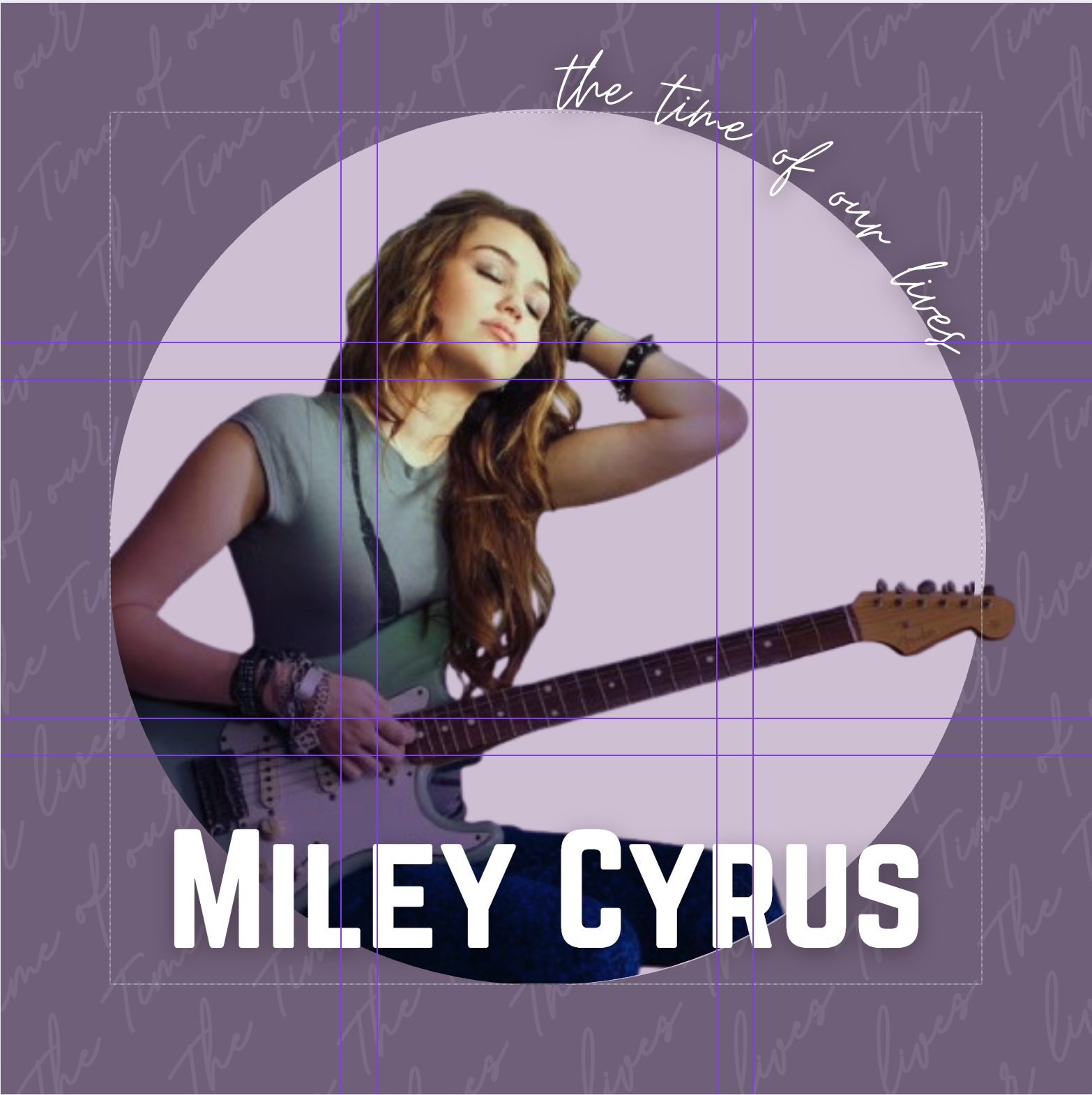
Grid System
Grid System: Applying a 3x3 Modular Grid for Structure and Balance
Objective: To elevate the design from a simple arrangement to a professionally structured composition, a formal grid system was implemented. The chosen grid provides an invisible scaffold that aligns each element with purpose, ensuring visual harmony and a clear hierarchy.
Grid Selection & Application:
-
System: A 3x3 modular grid was selected as the foundational structure for this design. This grid, which also forms the basis of the classic Rule of Thirds, is ideal for creating balanced, centered compositions while providing clear guidelines for placing supporting elements.
-
Alignment Strategy:
-
Focal Point: The central circular frame containing the artist's portrait is perfectly aligned within the center module of the 3x3 grid. This placement reinforces its importance and creates a powerful, undeniable focal point.
-
Typographic Anchor: The primary logotype ("Miley Cyrus" in Norwester) is aligned to the bottom-center module. Its baseline rests on the lower horizontal grid line, providing a solid, stable anchor for the entire composition.
-
Supporting Elements: The album title ("The Time of Our Lives") and the background textural script are organized within the remaining modules, ensuring they support the main elements without creating visual clutter.
-
Conclusion: The application of the 3x3 grid transforms the layout into a deliberate and sophisticated design. It provides a rational structure that creates perfect symmetry and balance, guiding the viewer's eye exactly where it needs to go. This underlying order is what gives the final album cover its clean, professional, and timeless quality.