
Project Overview
Prompt: Create website for a local bakery
The problem:
Bri’s Bakery lacked an online presence where customers could easily browse menu items, place orders, and purchase merchandise. Without a dedicated website, users did not have a streamlined way to explore products or complete purchases online, limiting convenience and potential business growth.
The goal:
Design a responsive website that enables customers to efficiently browse the menu, order bakery items, and purchase merchandise through a seamless and user-friendly experience.
In this case study, I :
- Defined the core problem and identified key user pain points
- Created paper and digital wireframes
- Developed a low-fidelity prototype
- Conducted a usability study to validate design decisions
- Designed a high-fidelity prototype
- Applied accessibility best practices throughout the UX process
- Evaluated key takeaways and identified next steps for future improvements
Understanding the User
User Research:
Based on general market insights and common consumer behavior patterns, the primary target audience includes young to middle-aged adults who frequently search online for local dining options. Many individuals in this demographic visit bakeries or dine out one to two times per week and rely on digital platforms to explore menus, read reviews, and gather information before making purchasing decisions.
This audience values convenience and efficiency, making features such as online menu browsing and advance ordering especially important. Designing with these behaviors in mind helped inform navigation structure, content hierarchy, and the overall ordering experience.
User Pain Points:
1. Limited Online Presence
Without a dedicated website, potential customers may struggle to find important information such as location, menu offerings, and pricing. This lack of digital visibility can reduce awareness and make it difficult for users to determine whether the bakery meets their needs.
2. Time Constraints
Ordering in person can be inconvenient, especially during peak hours when lines are long and time is limited. Customers looking for a quick and efficient experience may feel discouraged if the process is slow or unclear.
3. Disorganized Ordering Experience
In-store ordering can sometimes feel overwhelming, particularly when menu options, pricing, and customization choices are not clearly displayed. Customers may find it difficult to review all available items and make informed decisions on the spot.
4. Stress During Group Orders
Ordering at the counter (especially for multiple people) can create pressure and stress. Customers may feel rushed while trying to finalize decisions, leading to a less enjoyable overall experience.
Starting the Design
Paper Wireframes:
I began the design process with initial paper wireframes to explore layout and navigation concepts for the bakery website. The first round included six sketches focused on testing different homepage structures and screen variations. I then developed eight additional wireframes to explore secondary page types and key user flows within the site.
This iterative sketching process allowed me to evaluate multiple layout approaches early on and ensure that the final digital wireframes were intentionally designed to address identified user pain points and support a seamless ordering experience.


Digital Wireframes:
Next, I translated the strongest concepts from the paper wireframes into a digital format using Figma.
.jpg?width=1920&height=1080&name=Neutral%20Orange%20Simple%20Modern%20User%20Persona%20Presentation%20(5).jpg)
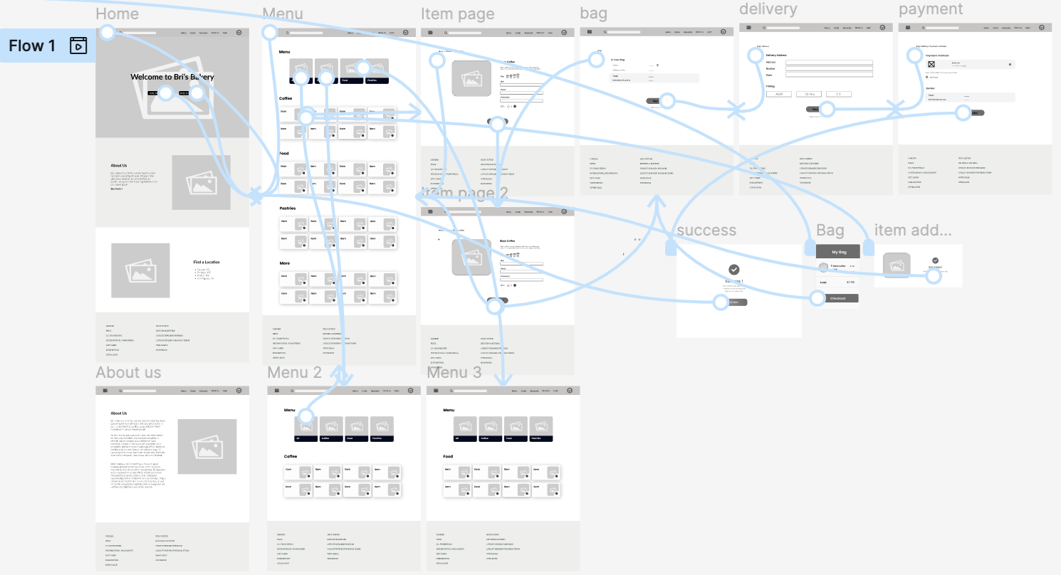
Low-fidelity Prototype:
Using Figma’s prototyping features, I developed a low-fidelity prototype that simulated basic user flows and navigation. This prototype served as an early tool to test usability, validate design decisions, and identify areas for improvement before moving on to higher-fidelity designs.
Usability Study:
I shared the low-fidelity prototype with a few colleagues and peers to gather informal feedback on navigation and overall usability. Their observations helped identify areas for improvement and guided iterations, ensuring a smoother and more intuitive experience before developing the high-fidelity prototype.
Here are the some of the suggestions:
.jpg?width=1920&height=1080&name=Neutral%20Orange%20Simple%20Modern%20User%20Persona%20Presentation%20(6).jpg)
Refining the Design
I implemented design and prototype updates after user testing.
Theme 1: Make menu categories clickable and separate each out
Goal: Add a category for all items and then only show the filtered items when clicked upon on the menu categories.
.jpg?width=1920&height=1080&name=Neutral%20Orange%20Simple%20Modern%20User%20Persona%20Presentation%20(7).jpg)
Theme 2: Give confirmation after clicking the plus button on the menu screen
Goal: Create screens to tell the user their action was a success
.jpg?width=1920&height=1080&name=Neutral%20Orange%20Simple%20Modern%20User%20Persona%20Presentation%20(8).jpg)
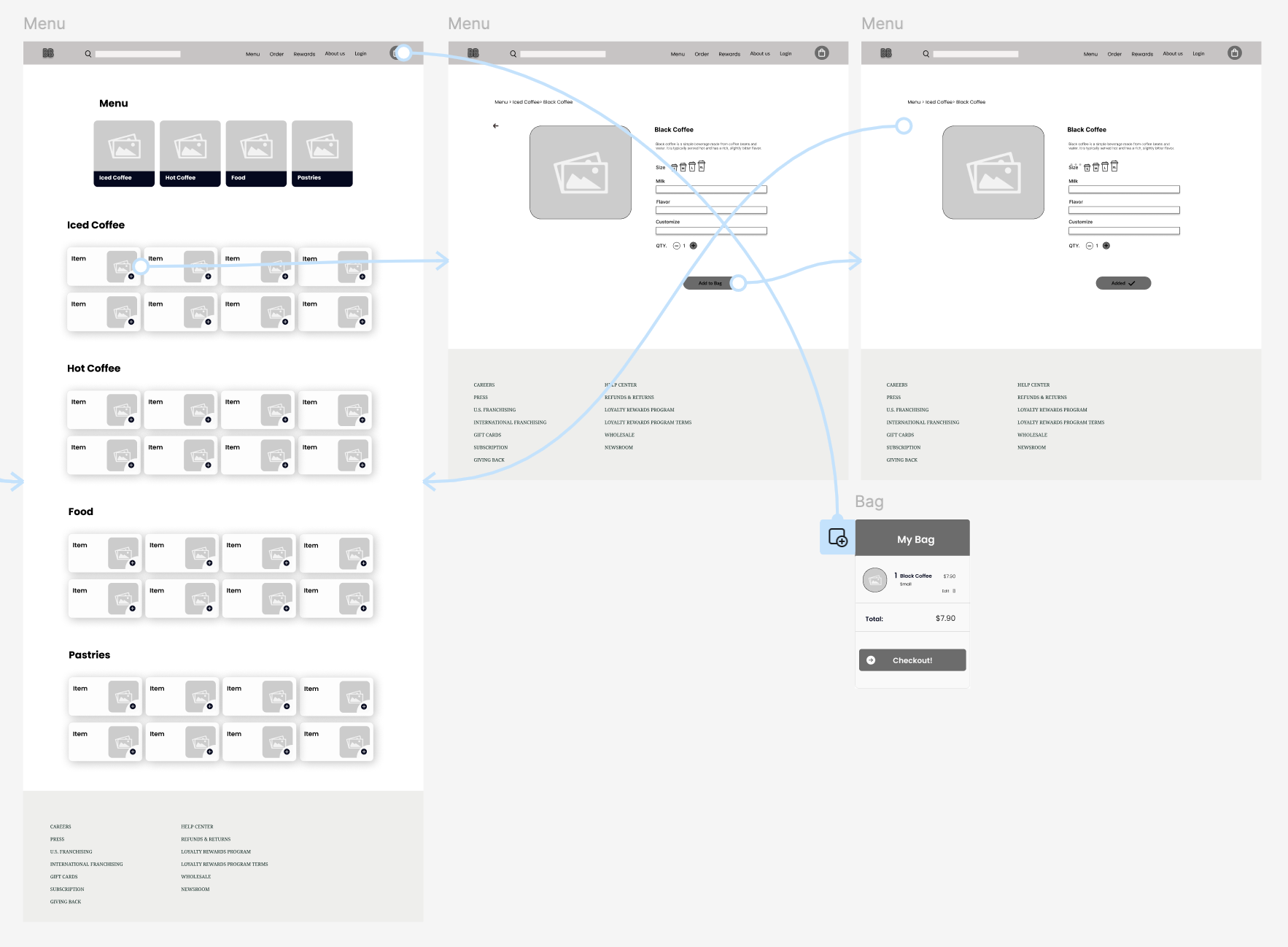
Theme 3: Confusion on what to do/where to go after adding item to bag
Goal: Create a clear next step for the user after adding an item to their bag. Add in an option to keep shopping or view their bag.
.jpg?width=1920&height=1080&name=Neutral%20Orange%20Simple%20Modern%20User%20Persona%20Presentation%20(9).jpg)
High-fidelity prototype:
I took suggestions from the user testing and edited the mockups and prototype to create a high-fidelity prototype.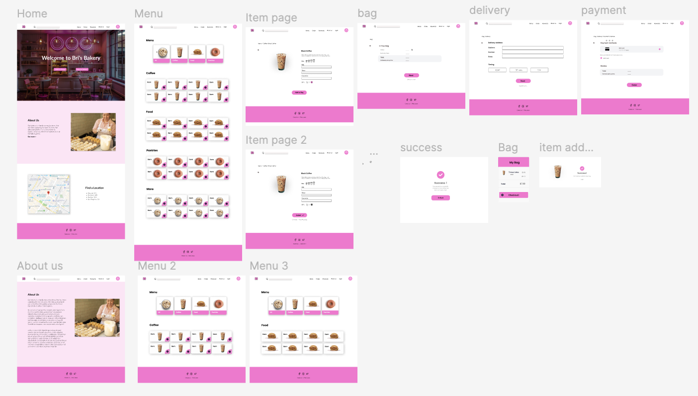
Accessibility Considerations

Next Steps:
1. Align on scope and requirements.
Take time to walk the developers through the designs and talk through how things are supposed to work. This is the moment to clarify edge cases, interactions, responsive behavior, and accessibility expectations so there are no surprises later.
2. Provide complete design specifications and assets.
Make sure design files are clean, organized, and complete. Include specs, components, spacing, typography, colors, and notes on interactions so developers aren’t left filling in the gaps or making assumptions.
3. Establish feedback loops and QA checkpoints.
Agree on milestones for reviewing work in progress to ensure the build matches the intended UX. Plan for design QA before launch to validate visual accuracy, usability, and accessibility compliance.
Takeaways
Impact:
These designs create a seamless desktop experience that allows users to quickly browse the menu, locate products, and complete orders with minimal friction. By improving navigation, content hierarchy, and overall usability, the website supports faster decision-making and a more efficient checkout process.
To measure success, we will track key metrics such as website traffic, conversion rates, and total online orders. In addition, post-purchase surveys and user feedback will help identify areas for continued improvement and ensure the experience continues to meet customer needs.
What I learned:
Through this project, I learned how to translate an existing mobile app experience into a responsive website while maintaining brand consistency and usability. Since I had already designed the bakery’s mobile app, this process challenged me to think more deeply about how user behavior shifts across devices and screen sizes. I had to reconsider navigation patterns, content hierarchy, and layout decisions to ensure the website felt intuitive on desktop while still aligning with the original app experience.
I also strengthened my understanding of iterative design by moving from paper sketches to high-fidelity prototypes and validating decisions through usability testing. Most importantly, this project reinforced the value of accessibility and thoughtful user flows, ensuring that customers could easily browse the menu, place orders, and purchase merchandise without friction.